Abstract Art Cards Anniversary Cards

The front cover of this anniversary greeting card should feature a bold and vibrant abstract representation, seamlessly blending the structural elements of Mondrian with the fluid chaos of Pollock, accented by the surreal playfulness of Miró.

**Background:** 
Begin with a layered base of softly overlapping rectangles in various shades of soft pastels – think pale blues, lavender, and muted peach, reminiscent of Rothko's color field paintings. Interspersed among these fields are slender black lines forming an underlying grid, a subtle nod to Mondrian’s precision and structure, creating a gentle geometric foundation.

**Central Elements:**
In the foreground, float abstract shapes reminiscent of Kandinsky’s dynamic compositions. Use circles, triangles, and irregular forms in bright, contrasting colors: vibrant red, sunny yellow, deep royal blue, and emerald green. Each shape should possess a slight translucency, allowing the soft hues of the background to filter through.

**Textural Details:**
Incorporate Pollock’s influence with intricate splashes and drips of metallic gold and silver, weaving through the scene, adding a dynamic layer of energy and movement across the card. The paint seems to dance around the geometric forms, introducing an element of surprise and spontaneity.

**Highlight Objects:**
Introduce two intertwined spirals, one in a deep crimson and the other in a rich indigo, gracefully intersecting at the center of the card. These spirals symbolize unity and should appear as if they are subtly floating, anchored by a de Kooning-inspired bold brushstroke of pure white underneath them.

**Surreal Elements:**
From Miró, incorporate whimsical stars and delicate, hand-drawn lines extending from the spirals. These elements should meander playfully across the card, creating a sense of motion and connection, with small dots of neon orange and bright pink peppering the landscape.

**Text:**
The words "Happy Wedding Anniversary" should be integrated seamlessly into the design, following the organic flow of the artwork. Use a clean, sans-serif typeface in pure white, set against the darker elements to ensure legibility, and let the text echo the movement of the abstract shapes, almost as if it were part of the artwork itself.

The final composition should balance abstraction with intention, inviting viewers to explore the scene and discover the joyous celebration of an anniversary within its vibrant and dynamic forms.
Generated with these themes: Happy Wedding Anniversary.
Made with ❤️ by AI.

The front cover of this anniversary greeting ...

The front cover of this anniversary greeting ...

On the front cover of this anniversary greeting card, imagine a whimsical, abstract homage to Paris, intertwined with playful feline elements. 

In the background, a kaleidoscope of geometric shapes reminiscent of Piet Mondrian's work sets the stage. Rectangles and squares in a harmonious palette of deep cobalt blue, crimson red, sunflower yellow, and pure white create a structured, grid-like backdrop, giving a nod to the iconic Eiffel Tower. Within this grid, a slender silhouette of the Eiffel Tower emerges, formed entirely of interlocking black lines and dots, like a simplified vision straight out of a Kandinsky painting.

Floating across this vivid backdrop, paint the abstract figure of a cat. Its body, a series of swirling, sweeping strokes in a style akin to Willem de Kooning, dances across the card. The cat's fur is a chaotic blend of splattered hues—marble gray, midnight black, and whispers of ginger, reminiscent of a Jackson Pollock masterpiece. Its eyes, two large almond shapes, glimmer with a touch of metallic silver, adding a playful, shimmering accent.

Above this captivating scene, a banner arcs across the top, its edges curling like a playful ribbon. The banner's surface is an abstract mosaic of colors—fiery oranges and oceanic blues—layered in translucent washes, drawing inspiration from Mark Rothko’s color fields. In the center of the banner, the name "Simon" is etched in bold, blocky letters. Each letter is filled with a different hue: vibrant lime green, electric pink, and rich violet, making it pop against the multicolored background.

Sprinkled around this central imagery, small, doodle-like stars and spirals, echoing the whimsical strokes of Joan Miró, add an extra layer of texture and depth. These elements, drawn in contrasting black and white, pepper the scene with an added touch of abstract playfulness.

The card's overall composition blends bold geometric structures with freeform, dynamic elements, creating a delightful, abstract anniversary homage to Paris and cats, infused with a playful spirit.
Generated with these themes: Cat, and Paris.
Made with ❤️ by AI.

On the front cover of this anniversary greeti...

On the front cover of this anniversary greeti...

In this anniversary greeting card, the front cover is a harmonious explosion of abstract shapes, bold colors, and distinct forms. 

The background is a layered canvas reminiscent of Mark Rothko's style, featuring deep, vibrant hues of azure blue and forest green blending into each other like the rolling contours of mountains at dusk. 

In the foreground, a Kandinsky-inspired geometric representation of two hikers—Caleb and Jordan—is depicted. Their figures are suggested through intersecting lines and colorful triangles, suggesting motion and adventure. Their "hiking trails" are arcs of swirling colors that sweep across the scene, accented with Mondrian-esque blocks of red, yellow, and black.

Adjacent to the hikers, two whimsical, abstract renditions of cats, Lucy and Ethel, crafted from intertwining loops and soft circular shapes, sit atop a series of Pollock-like drizzles, suggestive of a rocky mountain path. The cats are rendered in deep oranges and soft grays, with exaggerated whiskers and ears in vivid pinks and whites.

Peacocks, in the spirit of Miró, dance through the sky, their tails a dazzling spectrum of spirals and dots, ranging from emerald greens to sapphire blues, with eyes of striking violet. Their presence is both grounded and ethereal, as they seem to float above the abstract landscape, feathers creating a bridge between the mountains and the sky.

At the base of this composition, a kitchen setting is alluded to with de Kooning-inspired strokes: a collection of oversize cutlery and abstract forms suggesting pots and pans, done in metallic silvers and earthy copper tones, sit amidst the swirling patterns. 

Amidst this vibrant chaos, a thin, wavering Twombly-esque line spells out "Caleb & Jordan" across the sky, as though written by the tip of a painter's brush in the misty air. This line gently meanders above the mountain peaks, integrating into the scene as both part of the landscape and the clouds.

This scene captures the essence of an anniversary, using abstract art to intertwine the beloved themes of hiking, cats, peacocks, and cooking, each element crafted with bold strokes and striking colors to create a truly unique and personalized card.
Generated with these themes: Hiking in the mountains , Their two cats Lucy and ethel, Peacocks , and Cooking.
Made with ❤️ by AI.

In this anniversary greeting card, the front ...

In this anniversary greeting card, the front ...

**Card Front Design Description:**

1. **Background**: The card's background is a swirling vortex of rich, deep blues and vibrant oranges, reminiscent of Gerhard Richter's color field explorations. These colors blend and contrast, creating a dynamic backdrop that feels both infinite and intimate.

2. **Central Shapes**: 
   - In the center, a large circular shape, inspired by Kandinsky, is filled with smaller geometric shapes such as triangles, squares, and rectangles in primary colors: bold reds, sunny yellows, and deep blues. These shapes overlap and interconnect like a playful Mondrian grid.
   - Within this central circle, an abstract depiction of a vintage camera lens is made using concentric circles and overlapping arcs, with hints of metallic silver and charcoal gray, nodding to the concept of capturing travel memories.

3. **Abstract Travel Elements**:
   - To the right, a jagged, Pollock-inspired line in black and white zigzags across the card, mimicking the unpredictability of travel paths.
   - On the left, de Kooning-style swoops and swirls of mint green and coral pink suggest abstracted landscapes and ocean waves, symbolizing faraway destinations.

4. **Details and Accents**:
   - Scattered across the card are small, Miró-esque stars and dots in gold, reflecting a night sky or the twinkling excitement of new adventures.
   - An abstract airplane shape flies across the top, constructed from simple lines and curves, with a dotted trail of ink behind it in a vibrant purple, giving a sense of movement.

5. **Text Element**:
   - At the bottom of the card, a whimsical banner unfurls in a fluid motion, as if caught in the wind. The word "Love" is written in a bold, Twombly-inspired script, appearing as if it were part of the movement, with each letter slightly slanted and playful.
   - The banner is painted in a soft lavender, standing out against the bold background colors.

6. **Additional Features**:
   - In the bottom right corner, a small, abstract map in Rothko-style color blocks of forest green, mustard yellow, and soft cream alludes to both travel and the journey of love.
   - Dotted around this map are tiny black 'X's marking various 'destinations', inviting the viewer to imagine adventures to come. 

This card design captures the essence of abstract art's freedom and travel's boundless possibilities, celebrating an anniversary with vibrant, joyous creativity.
Generated with these themes: travel pictures with abstract content.
Made with ❤️ by AI.

**Card Front Design Description:** 1. **Back...

**Card Front Design Description:** 1. **Back...

**Front Cover Description:**

A vibrant and abstract montage springs to life, embodying the essence of an anniversary hiking adventure with a quirky twist. This scene blends geometric forms, energetic lines, and bold colors reminiscent of Kandinsky and Miró, creating an exciting tapestry of life and love.

**Background:**  
The backdrop is a series of intersecting mountain shapes, each composed of vivid triangles and rectangles in deep blues, purples, and greens, reminiscent of Piet Mondrian's color blocks. Splattered across this landscape are dots and zig-zag patterns in white and yellow, echoing Jackson Pollock's dynamic movement.

**Central Elements:**  
- **Hiking Theme:** In the center, abstract figures representing Caleb and Jordan, constructed from swirling lines and shapes, are ascending the mountains. Their "bodies" are composed of overlapping red, orange, and teal geometric forms that contrast with the background, capturing their adventurous spirit.
  
- **Cats:** Nestled within this abstract landscape, Lucy and Ethel, depicted as whimsical forms, are perched on the mountains. They are illustrated using curvy, organic shapes with bold patterns—Lucy in black and white spirals, Ethel in orange and green stripes, their feline silhouettes recognizable amidst the abstraction.

- **Peacocks:** On the left side, a burst of peacock plumage fans out in a rainbow of colors. Each feather is an individual, curved element, filled with concentric circles in blues, greens, and golds, drawing from Joan Miró's playful forms.

- **Cooking Elements:** Below the couple, a series of floating, abstract cooking utensils and ingredients—knives, spatulas, and vegetables—are interspersed with shapes and lines. Each element is rendered with the simplicity of Rothko's blocks of color but with a playful twist, suggesting motion and activity.

**Text Element:**  
Suspended above the scene, a banner ripples like a flag. Its edges are jagged, echoing the de Kooning style. Painted in contrasting red and turquoise, the text "Caleb & Jordan" dances across this banner in a mix of bold, angular letters and swooping curves, each letter a different color, like Cy Twombly's calligraphy.

**Additional Details:**  
- Small, abstracted sun and cloud shapes hover in the upper right corner, composed of overlapping circles and triangles in pastel hues, adding depth and contrast.
- The ground is a patchwork of Rothko-inspired squares in earthy tones, anchoring the dynamic composition with a touch of grounding warmth.

This card is an eclectic mix of abstract artistry, where each shape and color tells a part of Caleb and Jordan’s unique anniversary story, blending their passions into a singular, captivating vision.
Generated with these themes: Hiking in the mountains , Their two cats Lucy and ethel, Peacocks , and Cooking.
Made with ❤️ by AI.

**Front Cover Description:** A vibrant and a...

**Front Cover Description:** A vibrant and a...

Front and center, imagine an abstract composition where vibrant Mai Tai cocktails become the focal point of this anniversary card. The glasses, unconventional and geometric, are composed of various overlapping shapes: trapezoids, circles, and rectangles, reminiscent of Kandinsky's dynamic compositions. Each glass is filled with swirling layers of colors that bleed into one another like a Rothko painting—vibrant oranges, deep reds, sunny yellows, and refreshing greens—all representing the tropical essence of the cocktails.

In the background, a Mondrian-inspired grid of intersecting black lines forms a foundation for the colorful spectacle, dividing the card into asymmetrical segments. Each segment contains a different solid hue—bold blue, crisp white, and sunny orange—providing a backdrop that emphasizes the colorful cocktails in the foreground.

Floating above the scene, in a Miró-like whimsical style, abstract shapes resembling fruit slices—lemons, limes, and cherries—dance around the glasses. These shapes are depicted in bold colors with playful black outlines, adding a sense of rhythm and movement.

Amidst this vivid celebration, the name "Natalie" is seamlessly integrated into the scene. It appears on a swirling ribbon-like element that twists and turns between the cocktail glasses, its color shifting like a Richter canvas from bright pink to deep purple, maintaining a delicate balance with the surrounding colors.

The scene is anchored by a de Kooning-inspired background, where brushstrokes blend and blur together in an abstract sea of teal and turquoise, reminiscent of a serene ocean, suggesting the refreshing essence of a tropical getaway. This subtle, swirling backdrop adds depth and texture, ensuring the colorful elements remain at the forefront.

The card is a celebration of shape, color, and form, capturing the essence of a festive anniversary toast, a perfect blend of modern art influences that make for a striking and memorable greeting card.
Generated with these themes: Mai tai cocktails.
Made with ❤️ by AI.

Front and center, imagine an abstract composi...

Front and center, imagine an abstract composi...

Imagine a bustling abstract cityscape on the front of an anniversary card, with playful nods to the enigmatic theme of "31 fam." Picture this: in the foreground, a zany depiction of a family tree grows with branches that twist and curl like a de Kooning abstraction, each limb sprouting tiny, whimsical houses painted in bold blocks of color à la Mondrian. The tree itself is not rooted in soil but emerges from an exaggeratedly large, multicolored number "31" that acts as the base. Each number has an intricately painted texture reminiscent of Pollock's drips, blending and swirling in reds, blues, and yellows.

Behind this curious tree, a Kandinsky-inspired cityscape stretches across the card, where geometric skyscrapers rise in a discordant yet harmonious dance of shapes—triangles, squares, and circles interplaying like a Miro painting. Above, the sky is a Rothko-esque canvas of soft, gradient hues, transitioning from serene lavender to a vibrant orange, divided by thick, gentle brushstrokes.

Nestled among these buildings are tiny, barely noticeable abstract figures that suggest a lively family gathering; each figure is composed of simple, looping Twombly-like scribbles, giving a sense of motion and joy. And in the distant background, a thin, elegant line snakes through the scene like an Agnes Martin grid, connecting the elements with a subtle grace.

Incorporated subtly throughout the scene are small, quirky symbols—perhaps a droll rubber chicken or a mini disco ball—paying homage to the whimsical essence of an anniversary shared with family and close friends. This is a scene that invites laughter and a sense of abstract unity on the occasion of an anniversary celebration.
Generated with these themes: 31 fam.
Made with ❤️ by AI.

Imagine a bustling abstract cityscape on the ...

Imagine a bustling abstract cityscape on the ...

Reviews from Our Human Friends 🤖

What a breath of fresh air! Silly Robot Cards have bypassed any card manufacturer with their AI technology and card design(s) to capture the imagination and provide a platform to help produce truly personalised greetings cards. Not only that, there’s also human interaction with REAL people to respond to queries & requests providing real time help, assistance and support. A BIG high five to Silly Robots! 🙌 🤖

Hayley Quince - What a breath of fresh air!

Cool use of AI ... I think maybe Moonpig's days are numbered

Andy Baptist - Cool use of AI ..

What a great idea! You pick things that the person likes and this company makes an illustrated card including all the things you chose. So each card is unique to the person you chose it for. Brilliant idea. Card arrived, lovely quality. Happy buyer. Highly recommended.

Sue Blair - What a great idea!

I am absolutely thrilled to pieces with the valentines card I bought on this website, it is just too brilliant to put into words! Where other card websites failed Silly Robot Cards absolutely have come up trumps! I am so pleased. Thankyou so much!

Sarah Salt - I am absolutely thrilled to pieces

Example Printed AI Cards

High quality prints supplied with an envelope, delivered worldwide.
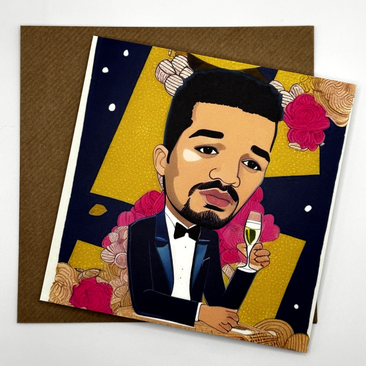
Example personalised card 1
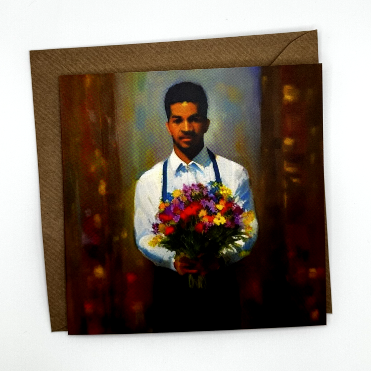
Example personalised card 2
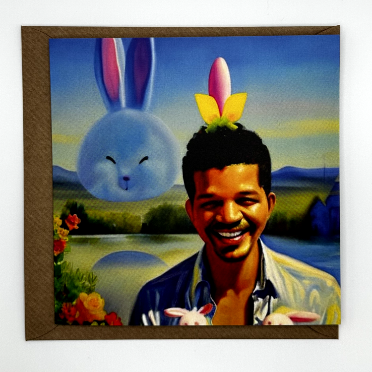
Example personalised card 3
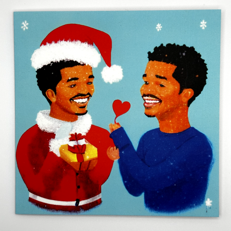
Example personalised card 4

Starting from $3.99 | Worldwide Shipping | Multi-pack Options Available

Frequently Asked Questions


How much does it cost?

It costs $3 to print a card.

Cards are printed and supplied with a paper envelope and a protective biodegradable OPP bag.

How long does it take for a card to arrive?

It typically takes 5 business days to arrive.

Shipping options for the USA are as follows:

OptionCourierPrice
Standard (5-12 business days)N/A$4.99
Expedited (3-5 business days)N/A$10.36
Overnight (1-2 business days)N/A$20.20

What size is the card?

5.5 x 5.5 inches (140 x 140mm)

Can I personalise the card?

Yes, you can write a message on the inside of the card from the basket page.

How do I send a card?

After creating a cards, you can add to your basket and checkout.

What quality is the card?

The card is a glossy card.

Supplied with a paper envelope and a protective biodegradable OPP bag.

What happens to my pictures after uploading?

All uploaded pictures are deleted within 30 days.

Environmental Impact

See how we're reducing our impact on the environment


Water-based inks icon

Water-based inks

Printed using water based inks.

Sustainabily sourced icon

Sustainably sourced paper or wood

From sustainable forests.

Vegan-friendly icon

Vegan-friendly

Contains no animal products.

Recyclable

Can be recycled.

logo
TwitterFacebookInstagram

Created By Gleeboard

© 2024 Silly Robot Cards. All rights reserved